What Your Brand Colors Say About You: A Guide for HNWIs
Are Your Brand Colors Speaking the Language of Luxury?
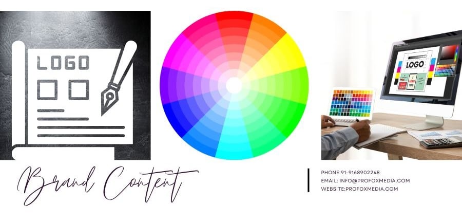
BRAND CONTENT
Darshana Turakhiya
1/18/20253 min read
Colors aren’t just visuals—they’re the voice of your brand. For high-net-worth individuals (HNWIs), the right colors can convey elegance, trust, and exclusivity. Curious to know what your brand colors are saying about you? Let’s explore the psychology behind luxury branding and find your brand’s perfect palette. Bonus: Take our fun quiz at the end!
Why Colors Matter in Luxury Branding
For luxury brands, colors are more than aesthetics—they’re a signal of value, prestige, and personality. The right palette doesn’t just attract attention—it inspires admiration and trust.
Quick Fact: Research shows that 93% of consumers focus on visual appearance when considering a brand, and 85% of them cite color as the primary reason for their decision.
Pro Fox Media’s Brand Palette: A Case Study in Elegance
Let’s take a moment to admire Pro Fox Media’s logo (yours truly!).
Colors Used: Deep Navy Blue, Brushed Platinum, and Soft Stone Gray.
Why It Works:
Deep Navy Blue represents sophistication and authority, making it perfect for a brand targeting HNWIs.
Brushed Platinum exudes timeless elegance and exclusivity.
Soft Stone Gray adds balance and modernity, ensuring the palette feels grounded yet luxurious.
Takeaway: This palette creates a powerful impression of trust, creativity, and high-end service.
Why Brands Struggle with Color Choices
Many brands fail to use colors effectively because:
They Choose Trends Over Timelessness: Trendy colors can date your brand, while timeless hues build longevity.
They Ignore Their Audience: HNWIs expect elegance, not flashiness.
They Don’t Understand Color Psychology: The wrong palette can send mixed signals and dilute your brand’s message.
The Psychology of Colors in Luxury Branding
1. Navy Blue: Power and Authority
Perfect for brands that want to inspire trust and credibility.
Commonly used by luxury banks, real estate firms, and high-end service providers.
Example: Pro Fox Media’s navy blue symbolizes trust and reliability in the digital marketing space.
2. Gold/Platinum: Wealth and Prestige
The quintessential luxury colors, representing success and exclusivity.
Often used by premium fashion and jewelry brands.
Example: Brushed Platinum in Pro Fox Media’s logo emphasizes sophistication and timeless appeal.
3. Gray: Modernity and Balance
Represents calmness, balance, and professionalism.
Great for brands that want to exude understated elegance.
Example: Soft Stone Gray adds a modern, grounded touch to Pro Fox Media’s branding.
4. Black: Elegance and Mystery
A bold choice that screams exclusivity and high-end appeal.
Often seen in haute couture and luxury automobile brands.
Tip: Pair black with metallic tones for added drama.
5. White: Simplicity and Purity
Reflects clarity, openness, and timeless sophistication.
Ideal as a complementary color to highlight other hues.
Tip: Use white as a background to allow vibrant luxury colors to shine.
Interactive Quiz: Find Your Brand’s Ideal Colors
Question 1: What feeling do you want your brand to evoke?
A) Trust and authority.
B) Prestige and exclusivity.
C) Modernity and innovation.
D) Simplicity and clarity.
Question 2: Who is your primary audience?
A) HNWIs seeking premium services.
B) Affluent individuals looking for luxury products.
C) Young professionals drawn to sleek, modern designs.
D) Everyone who values minimalism and elegance.
Question 3: How do you want your brand to stand out?
A) By exuding credibility and professionalism.
B) By being aspirational and iconic.
C) By feeling modern and relatable.
D) By being timeless and versatile.
Results:
Mostly A’s: Deep Navy Blue and Platinum. Your brand needs trust, sophistication, and timeless -appeal.
Mostly B’s: Gold and Black. Go bold with a palette that screams luxury and exclusivity.
Mostly C’s: Gray and White. Your audience will love clean, modern tones that feel fresh yet premium.
Mostly D’s: White and Silver. Minimalist luxury is your go-to style.
Why Choosing the Right Colors Delivers ROI
Improved Recognition: Consistent use of brand colors increases recognition by 80%.
Stronger Emotional Connection: The right palette resonates with your audience’s aspirations.
Higher Perceived Value: Luxury palettes signal exclusivity, justifying premium pricing.
Ready to Discover the Perfect Palette for Your Brand?
Your brand colors are more than a design choice—they’re your voice. At Pro Fox Media, we specialize in crafting luxury branding strategies that resonate with HNWIs and build lasting trust.
Contact us today to unlock the power of your perfect palette!
📧 Info@profoxmedia.com
📞 91-9168902248
🌐 www.ProFoxMedia.com
Pro Fox Media
Experienced marketing consultant. I’m excited to take whatever challenges you have to throw at me.
Contacts
Info@Profoxmedia
+91-9168902248